How to Get Through to Customers in 250 Milliseconds
Jun 19, 2019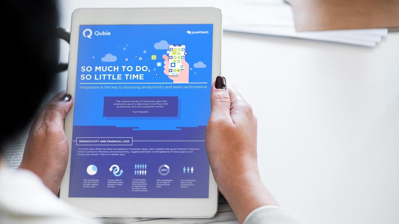

Katy Cesarotti | Former Gallery Design Studio Copywriter
Picture your ideal clients skimming your marketing materials in the five minutes between meetings and projects and tasks. What keeps them reading? How can you help consumers understand (and remember) your key messaging?
The human brain can process visual cues like size, orientation and color in 250 milliseconds. With data visualization, businesses can help their audience decipher data, understand its relevance to their goals, and improve information retention.
Data visualization can include:
- Bar charts
- Pie charts
- Scatterplots
- Infographics
- Timelines
- Heat map
- Flowcharts

Why it works: the science behind data visualization
Data visualization allows consumers to process information faster. While humans can find meaning in a symbol in a quarter of a second, it takes 6 seconds to read 20-25 words. Well-designed infographics or charts allow you to present information concisely in an accessible, instantly comprehensible format.
According to an MIT study, visualizations with familiar images or pictograms are more easily recognizable and therefore memorable to your target audience. Graphics allow you to make a lasting impression, so potential clients will be able to retain and recall the data later.
Researchers found that the exact same presentation was 43% more effective at convincing the audience to take action when it was delivered with visual aids. Great data visualization is actually useful to the audience and compels them to take the next step in the customer journey (going to your website, reading the whole document, understanding a certain message).
Beyond the hard facts
But data visualization can’t work in isolation. Successful communication is about more than proving your value to potential customers — it’s about forging an emotional connection. Our brains are hardwired to understand stories. A study by Stanford professor Chip Heath found 63% could remember stories, but only 5% could remember a single statistic. Company communications need to go beyond proving why your product is the best out there, and to demonstrate to customers how you will make their daily lives better or easier.
Just because your information is technical or analytical doesn’t mean it has to be dry. Data visualization can help you connect the hard facts to the soft emotions to craft a powerful, results-oriented story.
The components of great visual storytelling
Visual cues and icons help your consumers understand information easier and faster. Draw readers’ attention to key information with color, or use color to group categories and showcase patterns. Use size to indicate quantity and orientation to show trends over time.
Strategic visuals create context for facts and figures that might otherwise seem abstract. Use data visualization to show the relationship between two sets of data, draw attention to outliers, or illustrate key processes. Visuals can “connect the dots” to help users solve problems and take actionable insight based on the information you’ve provided.
Data storytelling works in concert with copy by adding meaning or complexity, instead of just restating the information in the text. Avoid text overload and shift some of that information to visuals to create “bookmarks” in longer-form copy that help the reader skim.
Creating beautiful charts or visuals doesn’t have to be a one-time effort, either. Data visualizations can be created for a presentation to investors, then be dropped into an infographic, to a whitepaper or social media posts.
What visual storytelling goes wrong
Don’t add graphics just for the sake of having them. Choose the best design layout, colors, format and organization to showcase the story you want your audience to remember. Good design is clear instead of cluttered, respectful of your consumer’s time and attention.

This chart from Twitter user @hallabus obscures the takeaway of the comparison. Do the bar graphs represent home runs or salary? The significance of this argument — how little Aaron Judge will make compared to the other athletes featured — is nearly invisible in the visual.
The possibilities of interactive motion graphics
Digital storytelling creates even more opportunities for two-way engagement with your audiences. In a study by the Internet Advertising Bureau, twice as many consumers said that interactive ads were memorable, compared to static ads. With interactive graphs or data sets, customers can navigate the available information on their own and pursue their own paths of interest.
This interactive map from the New York Times plots every building in the United States and is searchable by address or zip code. As a visual storytelling tool, the map allows users to access insights about their communities and relationships to history and geography in a novel, extremely personal way.

Hard data is tangible and convincing—but it doesn’t have to be boring. Use data-driven storytelling to craft emotionally powerful narratives around the facts. Data visualizations can bring abstract numbers to life and fuel memorable, shareable content.
About Gallery Design Studio
We're passionate about helping B2B businesses with their ongoing marketing communication design needs. We help our clients transmit complex information clearly, concisely and in a visually engaging way. Relentlessly curious, we're inspired by experimentation, and always looking for better ways to serve our clients.
We’ve collaborated with transformational businesses, both startups and more established companies such as Townes Wireless, Questback and CIT Bank.
Our services:
- Communication and Marketing Design
- Video & Animation
- Web & App design (UX/UI)
- Digital Customer Experience Design (DCX)
Get the creative support you deserve. Contact us today.
About the Writer
Katy Cesarotti is a copywriter at Gallery Design Studio. Katy believes that, with clear and concise copy, innovators can spark emotion and drive action in their readers. She’s written for magazines, blogs and cutting-edge startups.


